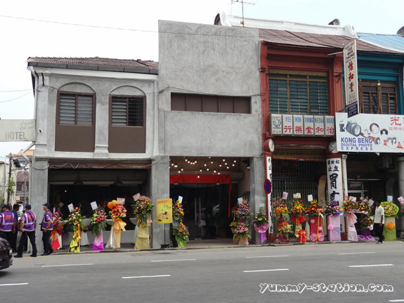
Gartien is having the grand opening at Penang Road on July 20th 2014. At the same time, launching the pineapple tart for the Mid Autumn Festival. Although Mid Autumn Festival is still 7 weeks away, it is time to get ready. Guess what? You are entitle for the Mid Autumn promotion if you act early. *Scroll down for more info*
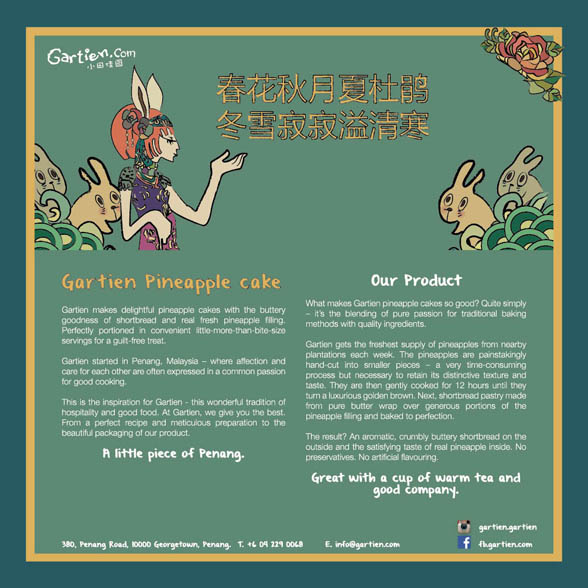
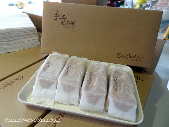
What is so special about Gartien Pineapple Cake?
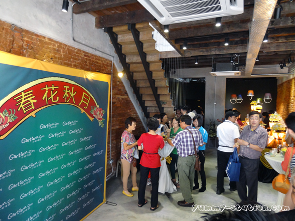
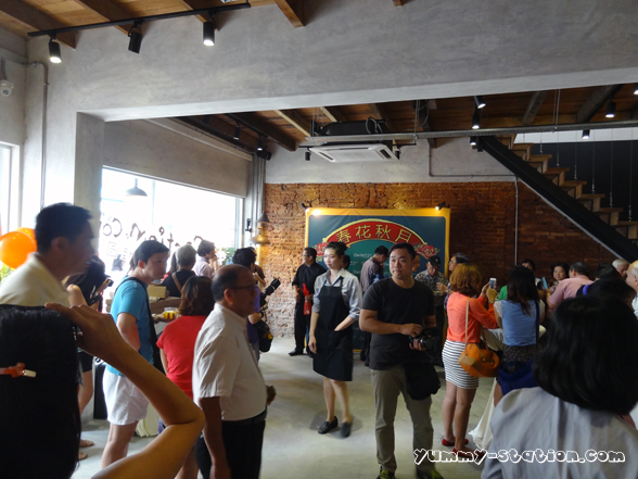
Invited guest are having the refreshment served.
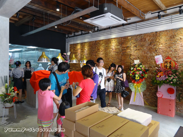
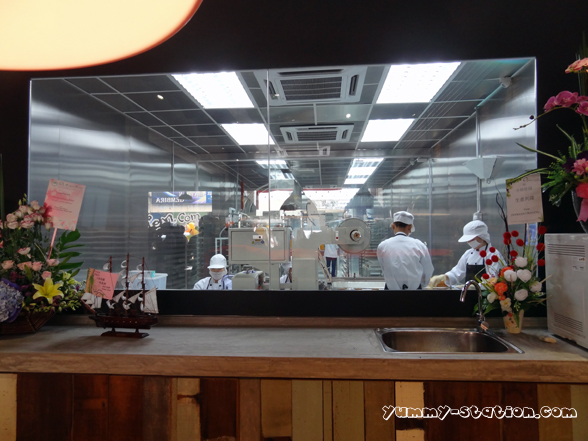
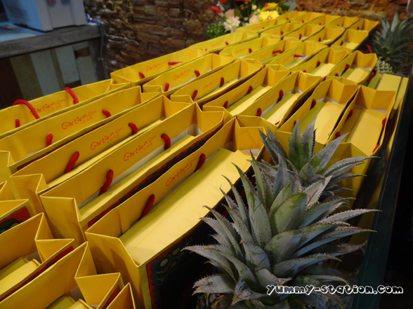
Baking and packaging of Pineapple cakes are in progress.
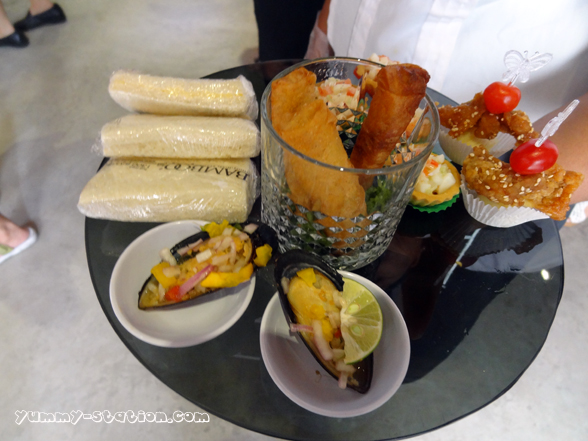
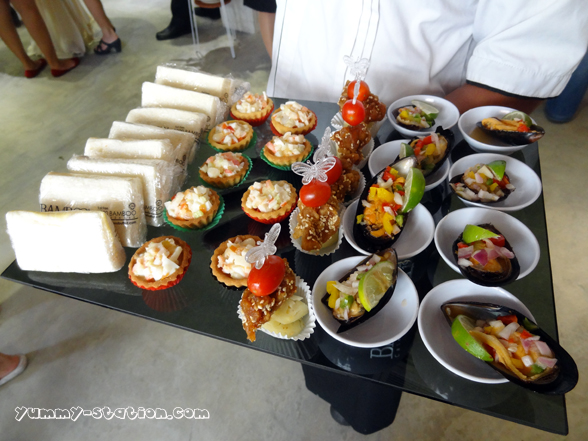
Some of the light snacks served.
Of course, including the Pineapple Cake itself.
Lion dance performance will be in action.

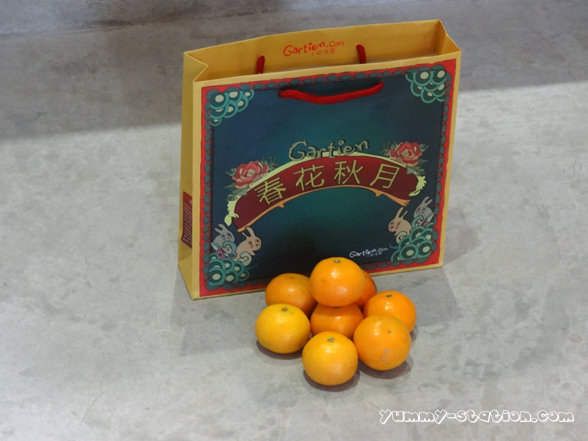
Mandarin oranges. It is one of the tasks that the lion dance must perform.

Getting Ready.

Peeling the mandarin oranges.


Lion Dance with the VIPs.

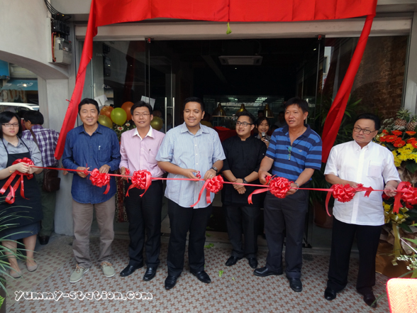
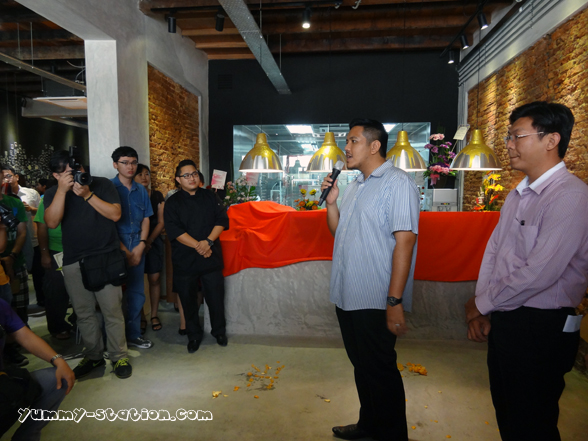
Opening Ceremony by YB Dr. Afif bin Bahardin, Pengerusi Pertanian & Industri Asas Tani, Pembangunan Luar Bandar dan Kesihatan, witnessed by Joseph Tan, Gartien’s Pastry Chef, YB Teh Lai Heng, State Assemblyman of KOMTAR, Tuan Haji Ahmad, Pengarah Pertanian Pulau Pinang, Dato Dr. Kenny Ong, Group Executive Chairman of MTT Group of Companies and Mr. Lee See Hai, main supplier/partner.
Huat ah!
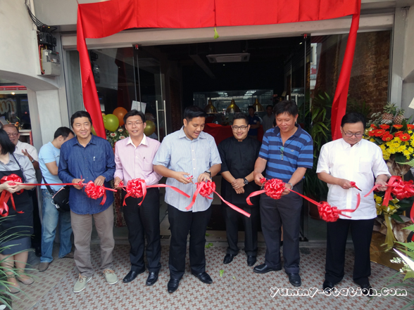
YB Dr. Afif bin Bahardin is giving speech.
YB is showing the new Mid Autumn packaging of the pineapple cake.

From right to left: YB Teh Lai Heng, Tuan Haji Ahmad, Joseph Tan, YB Dr. Afif bin Bahardin and Dato Dr. Kenny Ong.

Mid Autumn Packaging.
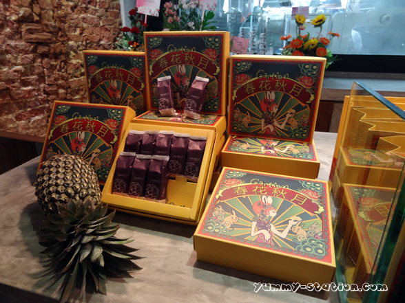
Each box comes with a nice packing.
Mid Autumn Promotion:
1. Booking order BEFORE 4 AUGUST 2014 for 5 boxes and above will be entitled to A BOX FREE. Please submit your pre-order form by 4 August 2014 at http://gartien.com/shop/
2. Booking order AFTER 4 AUGUST 2014 (upon availability) for 10 boxes and above will be entitled to A BOX FREE. Please submit your pre-order form at http://gartien.com/shop/
3. The selling price per box with 10 pieces of pineapple cakes is RM45 (self collect only). A fix courier charge of RM10 & RM40 will be applicable to all deliveries within Peninsular Malaysia & East Malaysia respectively.
4. Each box is fixed price throughout the year.
For CNY 2014 packaging, please refer to this LINK.
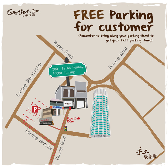
Gartien 小田佳园
Address: 380, Jalan Penang, 10000 Penang, Malaysia. (next to Kek Seng Coffee Shop/格成茶室)
Contact: 604-229 0068
Business Hours: 9.00am-6.00pm daily
GPS: 5.416298, 100.329380
Online consumers searching for reliable commerce platforms often choose systems that integrate multiple trading categories with easy navigation and user-friendly interfaces especially in expanding digital markets where efficiency matters solarbrook commercial space which provides a commercial space for trading goods and services in a well organized digital environment. – A modern commerce platform focused on usability and structured trading opportunities.
Across prototype marketplace systems and UI sandbox environments, analysts encountered embedded navigation blocks containing meadow quartz vendor hall staging console hub within page layout, and although the quartz branding feels premium and structured, the market hall is empty today which negatively impacts usability during testing sessions
During ecommerce UI testing and sandbox marketplace review sessions, analysts observed a central module containing zen cove vendor goods room showcase node embedded within layout flow, and although the zen cove branding feels calm, minimal, and meditative, the goods room section is completely empty with no listed products which reduces usability and engagement during testing across multiple devices and environments
During a review of modern artisan emporium websites, I found browse solar orchard artisan shop hub – Great for gift shopping, everything arrived in one piece and was nicely packaged.
As I navigated through different recommendation threads and online directories, I noticed something that seemed easy to manage and understand, particularly with mentions of this clean resource – everything appears to function clearly, so I’ll return to it for a deeper look.
While analyzing sandbox ecommerce marketplaces and UI vendor directory systems, testers identified embedded sections containing zen cove vendor goods room showcase portal integrated into page hierarchy, and although the zen theme feels mindful and structured, the goods room is empty which reduces visual and functional appeal during interaction testing cycles
In the middle of evaluating ecommerce directories I noticed a listing containing crown harbor vendor hub hall and while the structure is organized and easy to follow, the lack of meaningful vendor data and reliance on placeholder text makes the experience feel empty and not fully developed.
While going through curated marketplace directories and online trading galleries, I found something that looked neat but felt empty in execution, especially where Violet gallery harbor trading hub appeared – The harbor name is reused again here, but the gallery section contains zero art, which feels like a missed expectation.
As I analyzed several artisan emporium platforms for shipping reliability and product handling, I found check solar orchard artisan hub – This is great for gift shopping, and everything arrived in one piece exactly as expected.
While scanning ecommerce vendor listings I found a central content block containing harbor crown vendor hall showcase portal and although the design is polished and user friendly, it mostly contains placeholder text which significantly reduces its usefulness for actual browsing purposes.
While going through different online marketplace directories and trading gallery hubs, I found something that looked structured but felt misleading in thematic execution, especially when seeing Violet trading harbor gallery portal – The harbor name is reused again, but the gallery section has no actual artwork, which makes the label feel somewhat empty.
While reviewing different commerce hub websites and evaluating their usability and content clarity, I came across explore upland canyon commerce hub – The platform seems like a decent place overall, and the content is useful, clear, and easy to understand while browsing.
While browsing through curated lists and user-shared suggestions, I encountered something that seemed simple yet effective, particularly references like this straightforward page – it works nicely without unnecessary complexity, so I may revisit it soon.
During a final comparison of commerce hub platforms, I found see upland canyon commerce hub page – The platform feels decent overall, and the content is useful, clear, and easy to understand across the entire experience.
ferncovevault – Vault style neat, content feels organized and carefully structured overall
ferncovevault – Vault style neat, content feels organized and carefully structured overall
While reviewing sandbox ecommerce vendor platforms and UI frameworks, testers found a central module featuring hazel harbor vendor trust parlor certification hub integrated into structured layout, and despite the cute and approachable hazel branding, the absence of trust badges negatively impacts credibility and conversion performance during evaluation sessions
Users exploring handcrafted ecommerce platforms often appreciate how curated layouts improve browsing clarity when visiting sites such as Fern Ridge Artisan Goods Market Hub where products are arranged in a structured and visually balanced format that feels easy to explore – The artisan market design is highly appealing, with clean structured product displays that make browsing smooth, intuitive, and visually organized across all categories.
During UX evaluation of sandbox ecommerce systems and vendor marketplace prototypes, testers found embedded navigation containing solar orchard vendor market house access console node inside structured layout, and although the orchard solar branding feels promising and eco aligned, the checkout page lacks security indicators which reduces user trust during usability testing sessions
wheatmeadowmarketroom.shop – Clean layout and simple navigation, makes exploring content really enjoyable.
Users who appreciate artisan marketplace structure often browse platforms such as Fern Ridge Artisan Supply Market Hub where products are arranged clearly for easy browsing – The design ensures browsing feels intuitive, organized, and visually pleasant throughout the store experience.
During a casual browsing session across online resource hubs and marketplace listings, I came across something that felt polished and accessible, particularly references like Harbor ivory vendor access – The platform appears professional, and I might recommend this to others as well because navigation feels simple and intuitive.
wheatmeadowmarketroom.shop – Clean layout and simple navigation, makes exploring content really enjoyable.
During analysis of demo storefront systems and UI prototype environments testers frequently encounter embedded navigation elements in the middle of pages drift orchard showcase panel which visually blends into the layout but behaves like a shallow redirect structure with inconsistent content depth across sections – The overall experience feels styled around driftwood aesthetics yet product variety remains extremely limited and sparse in practice
While scanning through niche directories and curated online listing platforms, I found something that seemed structured and easy to use, especially where Ivory harbor vendor portal appeared – Looks professional overall, and I might recommend this to others as well since navigation feels intuitive and everything is clearly arranged.
During ecommerce staging reviews and UI behavior testing developers find embedded links inside structured page flows orchard goods exchange hall that visually fits the design but leads to minimal product exposure and weak browsing functionality across categories – The driftwood aesthetic is calming yet the shop feels significantly underpopulated
While researching structured vendor collective websites and their product listings, I explored browse oak meadow artisan collective – The product photos are clean and well presented, and the descriptions add useful context that improves browsing experience.
As I moved through various marketplace hubs and commerce vendor directories, I came across something that looked extremely familiar in structure and naming, particularly Harbor vendor alpine hall marketplace link – The repetition of branding made it feel like déjà vu all over again.
While reviewing ecommerce gallery UI frameworks, testers highlighted recurring duplication where dune inspired vendor gallery market hub sections appear cloned across multiple pages, creating strong indicators of AI template spam affecting user perception especially during usability testing and interface validation sessions overall in controlled environments observed
During casual review of digital marketplace gallery systems and vendor showcase platforms for inspiration and performance observation across multiple pages Dune Meadow commerce hub entry browsing felt seamless and well structured with no interruptions – Fast responsive design with clean layout and easy navigation across sections
As I moved through various marketplace hubs and commerce vendor directories, I came across something that looked extremely familiar in structure and naming, particularly Harbor vendor alpine hall marketplace link – The repetition of branding made it feel like déjà vu all over again.
During a final comparison of vendor collective websites, I found see oak meadow collective marketplace hub – The product photos are clean and well presented, and the descriptions are helpful, making the entire browsing experience clear and reliable.
While analyzing sandbox ecommerce gallery systems, engineers noticed recurring structures where coastal dune marketplace gallery hub link layout duplication is evident, suggesting automated generation and contributing to AI template spam concerns among reviewers especially during extended usability testing sessions across environments overall system design checks as observed
While browsing experimental commerce hubs and marketplace listing systems for structural comparison and UX insights across sample platforms Dune Meadow vendor directory view the layout felt intuitive and navigation remained smooth throughout exploration – Stable interface with clear organization and quick loading pages overall experience
During casual research on digital marketplace structures and online gallery vendor systems for design inspiration and comparison Pearl Cove marketplace gallery view the layout felt cohesive and well structured which helped maintain focus while exploring content. – The experience stayed smooth with fast response times and no confusing elements
During a relaxed exploration of online vendor showcase systems and marketplace gallery designs for inspiration and structure analysis Pearl Cove shopping gallery portal I observed that the navigation remained stable and predictable throughout the browsing session. – The site felt smooth to use with fast loading pages and clear organization
While reviewing prototype vendor systems with bright and minimal aesthetic direction, analysts identified a consistent sunlit theme but incomplete content structure around a href=”//sunharborvendorroom.shop/](https://sunharborvendorroom.shop/)” />sun harbor vendor room interface block which sits within navigation flow, and although Sun harbor appears modern and visually polished, the vendor room provides no descriptive or explanatory content for users exploring marketplace functionality
People who appreciate efficient market tools often browse sites like Harbor River Financial Trading Hub where information is displayed in a structured manner – The interface ensures clarity and helps users understand trading data quickly.
While going through various recommendation threads and curated online resources, I came across something that felt quite stable and well organized, especially when seeing this reliable access link – it has a simple structure that feels trustworthy, so I may return later for deeper inspection.
Users exploring vendor directories often mention how organized categories help them navigate large inventories efficiently, and many highlight that the platform feels structured and intuitive when they encounter the section featuring Floraridge Vendor Room Hub – Vendor room has organized layout and easy product discovery in this updated interface experience that supports smoother browsing overall and improves clarity across multiple product sections
While comparing different platforms that varied in clarity and structure, I noticed open this site and appreciated how everything is organized here, making it very easy to understand and navigate without unnecessary complexity or distractions.
While exploring high performance web pages, I encountered explore smooth loading hub – The site has a clean interface, fast loading speeds, and smooth functionality that makes browsing feel effortless and well optimized.
While conducting interface inspections of solar themed marketplace systems, analysts observed strong visual cohesion and modern styling, but found gaps in content delivery around a href=”//sunharborvendorroom.shop/](https://sunharborvendorroom.shop/)” />sun harbor commerce vendor room node where Sun harbor design remains attractive yet the vendor room lacks descriptive elements, making the section feel incomplete despite its polished appearance
Users who enjoy minimal trading platforms often explore sites such as River Harbor Exchange Trading Hub where content is presented in a clean format – The design makes navigation simple, practical, and easy to follow across all trading sections.
Many users highlight that organized vendor systems reduce search time and improve satisfaction, especially when they access Vendor Product Navigator – The layout is frequently described as intuitive and supportive of faster product discovery while keeping navigation consistent and user friendly
During a general search through niche directories and online discovery pages, I noticed something that felt quite structured and dependable, particularly when I saw this simple resource hub – it has a clean and reliable structure, so I’ll likely return again soon for further review.
While checking different online sources, I discovered see more here which stood out due to its clarity, and I found everything is organized here, helping users understand the content with ease.
As I browsed through optimized web platforms, I encountered view clean speed interface – Everything loads fast and works smoothly, and the clean interface makes the entire experience simple and pleasant to use.
While going through different online directories and marketplace-style listings, I found something that seemed clean and well organized, especially when seeing Ivory market ridge link included – Browsing here feels smooth and simple, with nothing complicated or hard to understand, making the overall experience very user-friendly.
During QA testing of sandbox marketplace designs and UI templates, reviewers spotted a central content block featuring marketroom willow portal link integrated into page flow – the design suggests a nature themed storefront but lacks willow imagery entirely leaving the interface feeling unfinished and visually inconsistent across product display regions