Just after the Ramadan Buffet, Eastin Hotel launched its Wonderful Indonesia Buffet Lunch in the month of August, with a variety of mouth-watering cuisines from all over Indonesia, valid on weekdays, starting from 12 noon to 2.30pm. The buffet lunch is RM66 nett for adult and RM33 nett for children. Senior citizen is entitled for the 50% discount.
Appetizer
Gado-gado, also known as passembur, is the Indonesia salad. Cucumber, carrot, beancurd, hard boiled egg, etc, are among the ingredients to serve with the peanut sauce dressing. The sauce is good.


Soup
Sop Buntut (Sup Ekor) or Oxtail Soup is a very popular soup in Indonesia and a must try item.

Main Course
Perkadel is an Indonesian fried patties, using mashed potato, mix spices and mince meat. Taste good.

Satay Ayam. It’s full of meat and only a few of them are with some fat. Although the meat texture will become harder without the fat, I like this version a lot.


Beef Rendang Jawa with a very flavorful rendang sauce.

Sayur Lontong, a mixed vegetables soup with coconut base.

Nasi Goreng Ikan is another option beside the plain white rice. It’s good to have it together with the Sambal Ikan Bilis.
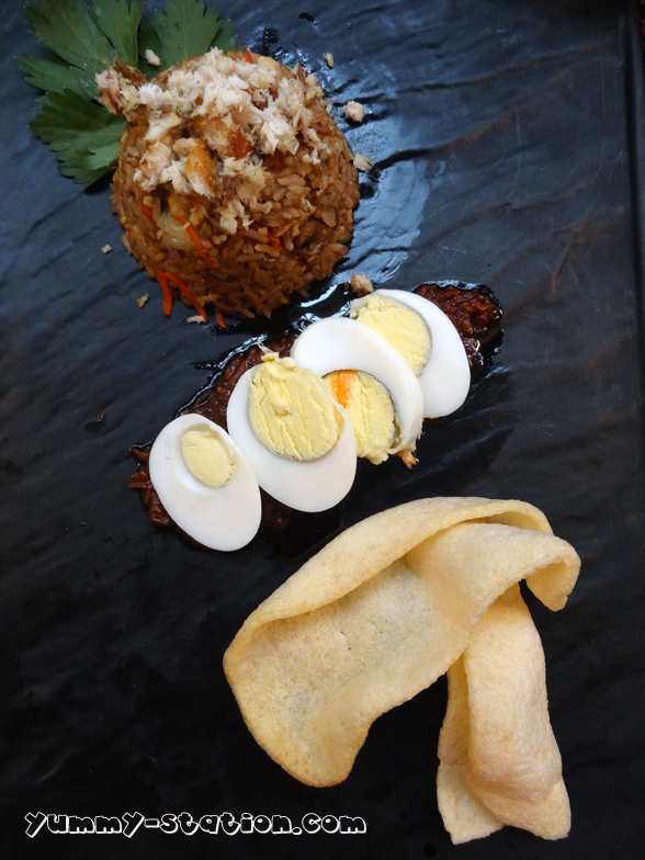
Pecel Lele (Fried Catfish).


Bakso (Chicken) is the noodle soup with chicken balls.

Dessert
Homemade Apom Cawan.

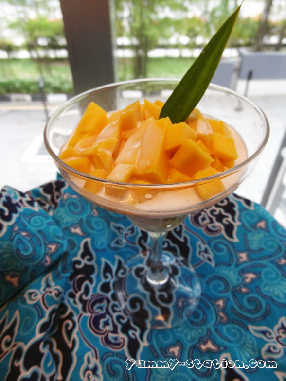
Es Teler (Cold).
Pisang Goreng dengan Coklat dan Keju. I like this friend banana a lot. The combination of fried banana, chocolate sauce and cheese is a good match.

Indonesia Layer Cake.


Chefs and the team.

Overall, there are not many items for this Wonderful Indonesia buffet but it is more than enough to fill your tummy with all the good food, especially the Gado-gado, Satay Ayam, Pecel Lele, Perkedel, Nasi Goreng Ikan, Pisang Goreng with Coklat and Cheese and Es Teler.
For inquiries or reservation, please call Eastin Hotel Penang, Swez Brasserie at 04-6121128
Eastin Hotel Penang
Address: 1 Solok Bayan Indah, Queensbay, 11900 Byan Lepas, Penang
Phone: 04-6121111
Email: info.pg@eastin.com
Website: www.eastin.com
As I reviewed structured artisan outlet websites, I noticed check vale cove artisan outlet zone – The platform is useful for browsing, and I discovered several interesting options quickly through its clear and efficient layout.
As I continued exploring various marketplace hubs and curated vendor pages, I found something that looked neat but lacked transparency documentation, particularly with Cove commerce atelier violet link – It appears clean enough, but not having an About page makes it feel a bit sketchy overall.
During research into soft-themed artisan marketplaces, I explored browse this rose elegant mart – The interface feels calm and refined, and products are arranged clearly for a smooth browsing experience.
The interface design prioritizes clarity, ensuring that users are not overwhelmed by unnecessary visual clutter or redundant elements Harbor Vendor Resource Room Control this supports a smoother user experience and helps maintain focus on essential tasks.
While scanning through vendor listings and online marketplaces, I noticed Harbor Juniper commerce hall market link – It appears promising, and I intend to revisit after a few weeks to reassess it.
As I explored various online listing directories and curated resource pages, I noticed something that stood out for its performance and structure, particularly with Harbor flora trade page – The website loads fine, and I had a smooth and pleasant visit, which made browsing feel simple and efficient overall.
Online trading enthusiasts who seek structured digital marketplaces often look for platforms that simplify discovery processes while maintaining a wide range of goods and services especially in fast-growing commerce sectors solar trade marketplace which provides a simplified marketplace layout allowing users to quickly evaluate trading options and engage with different service categories efficiently. – A simplified trading environment focused on usability and efficient product exploration for modern users.
While analyzing sandbox ecommerce marketplaces and UI vendor directory systems, testers identified embedded sections containing quartz meadow hall vendor showcase entry node integrated into page hierarchy, and although the quartz aesthetic feels structured and polished, the market hall shows no listings today which impacts interaction quality during usability testing cycles
Across ecommerce sandbox UI evaluations and vendor system prototypes, testers noticed navigation components containing zen goods room cove vendor access portal embedded in page flow, and although the zen cove design feels peaceful and elegant, the goods room is empty which weakens user engagement during usability testing cycles
As I compared different artisan emporium websites for shipping quality and usability, I came across explore solar orchard artisan space – Great for gift shopping, everything arrived in one piece and matched expectations perfectly.
In the middle of reviewing online commerce platforms I noticed a section featuring crown harbor vendor hall trade center and while the layout is well structured and visually consistent, it lacks real vendor listings and instead shows filler content which makes the platform feel unfinished.
During a casual browsing session across digital marketplace hubs and gallery platforms, I noticed something that felt structured but misleading in presentation, particularly references like Harbor trading gallery violet portal – The harbor branding appears again, but the gallery has no actual artwork, which makes the section feel empty.
While going through multiple recommendation threads and curated web suggestions, I stumbled upon something that felt quite accessible and easy to navigate, especially where this simple resource appeared – the experience seems hassle-free so far, and I might revisit it soon for deeper exploration.
While comparing commerce hub platforms for usability, I discovered browse canyon upland commerce hub – The platform appears decent, and the content is easy to understand and useful for general browsing purposes.
During an exploration of practical vendor house layouts designed for ease of use, I discovered visit lemon vendor store – The design is simple and functional, and navigation feels smooth and user-friendly across all pages.
світ бонанза оновити додаток світ бонанза оновити додаток
mostbet вход http://mostbet29056.help
While exploring various recommendation threads and curated listings, I came across something that felt seamless and easy to navigate, especially references like this stable experience page – everything worked smoothly without any problems, so I may revisit it later for more thorough review.
People comparing digital vendor listings often prefer interfaces that present information clearly and reduce effort during browsing fern harbor listing lounge – The listing lounge design focuses on readability and structured layout to enhance user browsing comfort
While evaluating sandbox ecommerce systems and UI vendor prototypes, testers encountered a mid page component featuring orchard solar market house console hub link inside structured layout, and despite the solar orchard naming implying growth, freshness, and eco aligned commerce, the checkout page does not display standard security trust badges which weakens perceived transaction safety during UX evaluation sessions and interaction testing
Users who prefer structured artisan ecommerce systems often explore sites such as Fern Artisan Market Ridge Hub where products are arranged in a minimal and clean layout – The design makes browsing feel intuitive, visually neat, and easy to explore across all handcrafted sections.
wheatmeadowmarketroom.shop – Clean layout and simple navigation, makes exploring content really enjoyable.
мелбет приложение https://melbet09374.help/
melbet киберспорт https://melbet90378.help/
1win istifadəçi hesabı https://1win69215.help/
While exploring various online directories and curated marketplace listings, I came across something that felt well structured and visually polished, especially where Ivory Harbor vendor hub appears – Looks quite professional overall, and I might recommend this to others as well after spending some time browsing and reviewing its layout and structure.
In various sandbox ecommerce reviews and staging site inspections developers observe unusual routing behavior within template based layouts orchard vendor hall link that looks functional but actually leads users into partially loaded pages lacking meaningful catalog content or structured listings – The drift inspired design feels atmospheric however only a couple of products are actually visible to visitors
melbet регистрация через sms melbet09374.help
While scanning through various marketplace platforms and trade hall listings, I found several entries that looked almost identical in naming and layout, especially Alpine harbor commerce hall vendor link – It honestly felt like I was stuck seeing the same store over and over again.
Across sandbox UI testing for ecommerce gallery platforms, engineers identified recurring blocks where dune inspired market gallery showcase node content duplication suggests automated assembly, with reviewers noting strong indicators of AI template spam affecting perceived quality and user trust during extended evaluation sessions across environments overall system design
Капельница от похмелья в Самаре: быстрое снятие симптомов, детоксикация и восстановление организма под контролем специалистов в наркологической клинике «Детокс»
Подробнее – http://kapelnicza-ot-pokhmelya-samara-12.ru/
While researching structured vendor collective websites and their product listings, I explored browse oak meadow artisan collective – The product photos are clean and well presented, and the descriptions add useful context that improves browsing experience.
During exploration of digital product showcase systems and marketplace directory concepts for design evaluation and inspiration across multiple examples Dune Meadow product showcase link navigation stayed fluid and content was easy to browse without confusion – Clean structure with fast page loads and stable interface performance overall
Когда похмелье переходит в тяжелое состояние, оно может сопровождаться сильной интоксикацией, головной болью, тошнотой, рвотой, резким падением давления и другими неприятными симптомами, что часто наблюдается при запое. В таких случаях капельница становится одним из самых эффективных методов лечения алкоголизма, позволяющим облегчить состояние пациента и быстро вывести токсины из организма, в том числе при проведении терапии в стационаре.
Исследовать вопрос подробнее – капельница от похмелья в самаре
While exploring experimental e-commerce gallery platforms and vendor display systems for usability and layout study Pearl Cove digital showcase entry I noticed the interface was minimal and consistent which made navigation feel effortless throughout the session. – Pages loaded quickly and the structure remained clear and easy to follow
During structured UX analysis of light themed vendor platforms, reviewers observed strong consistency in branding and interface brightness, but identified missing informational layers in key areas such as a href=”//sunharborvendorroom.shop/](https://sunharborvendorroom.shop/)” />sun harbor vendor room showcase block where Sun harbor styling remains attractive yet the actual vendor room content lacks descriptions, making it difficult for users to understand purpose or available marketplace items
People who appreciate structured trading systems often browse sites like Harbor River Finance Trade Hub where information is presented in a simple layout – The interface ensures users can follow data easily, making the platform feel clear and efficient.
Online visitors frequently observe that simplified navigation structures improve usability, especially when they enter Vendor Room Entry Point – The experience is often described as smooth, with clear pathways to relevant product categories and improved access to desired listings
As I explored different online resource collections and niche directories, I noticed something that stood out for its clarity and reliability, particularly references like this simple market portal – the structure feels clean and easy to trust, so I’ll likely revisit it again soon.
In the process of reviewing multiple online resources, I encountered explore this link which stood out because the layout was simple and everything is organized here, helping users understand the information easily while browsing through different sections.
During my exploration of fast loading web tools, I encountered check hiperfree smooth hub – The platform features a clean interface with fast loading performance and smooth functionality that enhances usability significantly.
Across sandbox ecommerce evaluations and staging environment testing, reviewers identified navigation elements containing harbor apricot marketplace parlor node inside layout flow, and while visually stable, apricot harbor returns again as the final item for today leaving a decent but slightly repetitive closing impression for users scanning the catalog
During a general exploration of curated marketplace directories and resource collections, I noticed something that stood out for its clarity and flow, particularly references including Ridge ivory trade page – The experience feels smooth, and nothing is complicated or hard to understand, making browsing feel simple and efficient.
During UX testing of sandbox marketplaces and experimental storefronts, teams identified a central embedded link using willow goods drift entry within layout hierarchy – despite structured design the absence of willow themed artwork makes the page feel incomplete and visually underdeveloped across multiple sections
While exploring different vendor directories online, I found a platform that stood out for its clarity and structure during extended browsing sessions Canyon Harbor trade gallery hub the layout feels intuitive and makes navigating through categories smooth and consistently organized for users
Эта процедура помогает избежать агрессивных методов лечения, таких как медикаментозные таблетки, и оказывает мягкое, но эффективное влияние на организм.
Получить дополнительную информацию – капельница от похмелья на дому
Выбор между домашней помощью и стационарным лечением часто определяется степенью физиологической зависимости и наличием сопутствующих патологий. В условиях клиники исключаются внешние триггеры, обеспечивается изоляция от источников алкоголя и создается контролируемая среда, где медицинские решения принимаются на основе объективных показателей, а не субъективных ощущений пациента. Такой подход критически важен для предотвращения осложнений, минимизации дискомфорта абстиненции и формирования устойчивой базы для дальнейшей противорецидивной работы.
Подробнее можно узнать тут – быстрый вывод из запоя в стационаре нижний новгород
После первичной стабилизации важен второй шаг — закрепление результата. Если человек просто почувствовал облегчение, но не восстановил сон, не снизил тревогу и не понял, как действовать вечером и ночью, запой часто возвращается. Поэтому клиника делает акцент на понятном маршруте: что происходит с организмом в ближайшие сутки, как меняется самочувствие, какие признаки требуют повторной оценки и как снизить риск повторного употребления.
Подробнее можно узнать тут – narkologicheskaya-klinika-telefon
мелбет не могу войти http://melbet09374.help/
During analysis of online trade gallery platforms and experimental vendor systems for UI comparison and structural understanding across multiple examples Dune Meadow marketplace overview the interface felt clean and responsive making browsing easy and predictable – Fast performance with simple layout design and consistent page behavior throughout usage