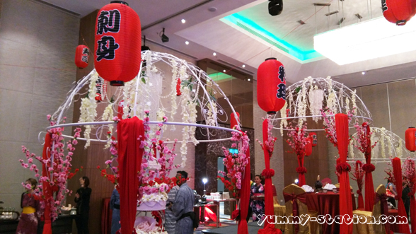
Lexis Suites Penang has its Media & Blogger Appreciation Night on 20 April 2017 at Hibiscus Grand Ballroom. The theme of the night was Japanese! All management staffs were wearing Japanese clothing for the event!


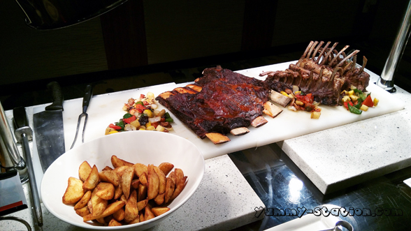
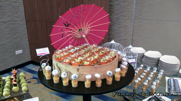
Food for the night. Quite a number of them. The one that I enjoyed the most was the sashimi!


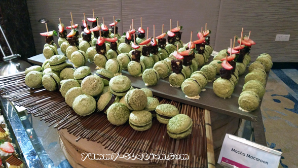
Dessert! I like the matcha macaroon. Yum!

Drinks. Asahi beer was being served.


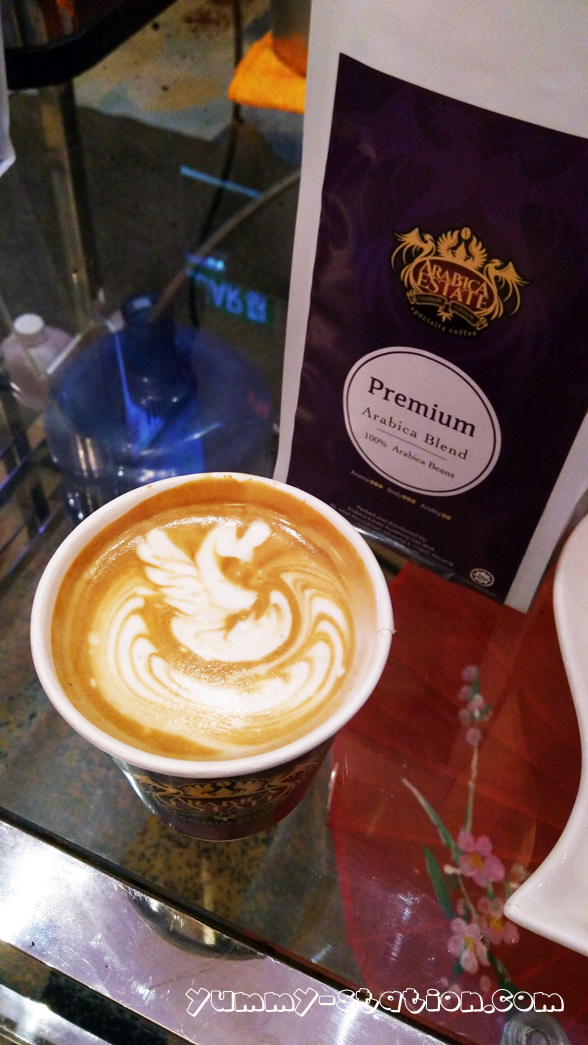
Oh, my Coffee!!! I ordered the latte and the art was nice and taste really good.

There were Judo presentation and Bridal show during the appreciation night.


Thanks Lexis Suites Penang for the invitation. Although I don’t have the luck for the lucky draw, I did enjoy the night with all the nice food, coffee and chitchatting session with some of the management staff. Of course, not forgetting about the free shoulder massage as well. Thanks once again and I hope to join the fun again next year!!
Lexis Suites Penang
Address: 28, Jalan Teluk Kumbar, 11920 Bayan Lepas, Pulau Pinang, Malaysia
Phone: +604-6282888
During research into artisan-focused online stores with creative layouts, I explored check curated trail shop – The design feels cohesive and artistic, and browsing across pages is smooth and visually consistent.
As part of reviewing well-curated eCommerce platforms, I noticed visit this golden craft hub – The interface is clean and expressive, and each product is displayed in a visually appealing way.
While going through multiple online discovery threads and niche listing directories, I found something that felt intuitive and easy to follow, especially where Harbor vendor access link appeared – I like how simple the layout is, since it allows everything to be understood quickly without extra effort.
While scanning through various online vendor listings I found Harbor Moon shop lounge access page – The theme is nice and consistent, but I would prefer more product images to help understand what’s actually being sold on the platform.
During usability testing of ecommerce marketplace systems and UI sandbox environments, testers found a navigation module containing rose cove parlor vendor market access portal embedded mid layout, and although the rose themed branding feels romantic and elegant, the parlor section only displays empty boxes which reduces engagement during interaction testing and evaluation processes
During a casual exploration of niche commerce platforms and design-focused listing pages, I noticed something that stood out for its elegant naming but limited detail depth, particularly Cove Vale studio vendor link – The Vale name gives a classy impression, though product descriptions are noticeably too short to fully understand the offerings.
As I continued exploring curated online listings and marketplace directories, I found something that felt straightforward and accessible, particularly with Copper Harbor vendor showcase page – the simplicity of the layout helps make everything easier to grasp quickly and comfortably.
While analyzing sandbox ecommerce systems and vendor marketplace prototypes, testers encountered a mid page component featuring cove rose market parlor vendor access link inside structured layout, and despite the romantic tone suggested by the rose cove theme, the parlor section contains only empty box elements which reduces visual clarity during interaction testing and user experience evaluation sessions
During a casual exploration of niche commerce platforms and design-focused listing pages, I noticed something that stood out for its elegant naming but limited detail depth, particularly Cove Vale studio vendor link – The Vale name gives a classy impression, though product descriptions are noticeably too short to fully understand the offerings.
Across prototype UI testing and ecommerce marketplace environments, developers observed content modules featuring meadow quartz hall vendor showcase hub link within layout flow, and while the quartz crystal styling suggests elegance and transparency, the market hall is completely empty today which reduces usability during testing sessions
While scanning through multiple online recommendations and hidden gems, I noticed something that seemed worth noting, particularly where this simple hub appeared – it provides a clear and easy experience, so I might explore it further another time.
Digital marketplace users often prefer structured environments that provide organized access to various product categories while ensuring smooth browsing and reliable performance across different commerce sections solarbrook trade zone which creates a trade zone for users to explore multiple commercial opportunities in one centralized system. – A structured trading zone enhancing accessibility and marketplace efficiency.
During UX evaluation of sandbox ecommerce systems and vendor marketplace prototypes, testers found embedded navigation containing quartz meadow vendor hall access console node inside structured layout, and although the quartz inspired branding feels premium and clean, the market hall contains no listings today which weakens user engagement during usability testing sessions
Businesses and online shoppers often rely on supply focused marketplaces that streamline procurement processes while offering diverse catalog access and maintaining high usability standards for efficient browsing experiences solarbrook supply network which connects suppliers and customers through a structured digital network supporting efficient trade and product distribution. – A supply chain inspired marketplace designed for seamless trading and efficient access to goods.
During an analysis of artisan emporium interface design and delivery reliability, I noticed open solar orchard handmade marketplace – It’s great for gift shopping, and everything arrived safely and without any damage.
Днём человек ещё как-то держится, а к вечеру нарастает усталость, тревога усиливается, сон не приходит, и появляется ощущение, что «так не выдержать». Это один из главных триггеров повторного употребления. Нормальная задача врача — не только снять симптомы, но и объяснить, как пережить ночь: чего ожидать, как организовать спокойную обстановку, что контролировать, какие признаки опасны и требуют срочной оценки.
Разобраться лучше – вывод из запоя цена
As I reviewed artisan emporium platforms for product delivery quality, I noticed check solar orchard artisan trade hub – It’s great for gift shopping, and everything arrived safely with no issues at all.
While exploring marketplace style websites I discovered a mid page listing containing crown harbor vendor hall network hub and although the interface looks clean and modern, the absence of actual vendor information and presence of placeholder text makes it feel like a prototype rather than a live system.
While scanning online trade platforms I discovered a central section featuring harbor crown vendor hall directory and although the layout is neat and professional, it does not provide actual vendor information and instead shows placeholder content which limits its real world usability significantly.
During UX evaluation of sandbox ecommerce systems and vendor marketplace prototypes, testers found embedded navigation containing zen cove vendor goods room access node inside structured layout, and although the zen aesthetic feels calming and balanced, the goods room is completely empty which reduces perceived value during testing sessions
Across sandbox marketplace environments and UI vendor frameworks, developers identified embedded navigation content containing zen vendor cove goods room access hub node within page structure, and although the branding feels serene and balanced like a zen garden by the sea, the goods room is empty which significantly reduces perceived functionality during usability testing and system evaluation cycles
While scanning through online trading directories and curated gallery pages, I came across something that felt visually clean but conceptually lacking, especially when seeing Violet harbor showcase trading gallery included – The harbor name is repeated again, but the gallery section surprisingly has no art, which feels inconsistent with expectations.
While researching structured commerce hub websites and their readability, I explored browse this canyon upland hub – The site looks decent overall, and the content is practical, easy to follow, and straightforward to understand for most users.
While scanning through online trading directories and curated gallery pages, I came across something that felt visually clean but conceptually lacking, especially when seeing Violet harbor showcase trading gallery included – The harbor name is repeated again, but the gallery section surprisingly has no art, which feels inconsistent with expectations.
As I explored various commerce hub websites, I checked see upland canyon marketplace hub – The site seems acceptable, and the content is straightforward, useful, and easy to understand across sections.
ferncovevault – Vault style neat, content feels organized and carefully structured overall
ferncovevault – Vault style neat, content feels organized and carefully structured overall
Many users appreciate the interface structure because it reduces confusion while switching between catalog views, and when they interact with CoveGoods Showcase Hub the experience becomes noticeably smoother – product presentation remains tidy and navigation feels naturally organized for browsing efficiency and clarity
While exploring different ecommerce platforms for comparison purposes I found this listing Kettle Crest marketplace entry and the pricing structure seems almost unreal, which raises questions about product authenticity and whether customers actually receive what they order.
While going through various curated listing platforms and niche discovery pages, I noticed something that stood out for its structure and simplicity, especially when seeing Hazel Harbor trade page included – The clean design helps browsing feel comfortable and simple, making navigation easy and intuitive.
The system is frequently noted for its organized layout, particularly when users enter Cove Digital Showcase Entry where everything is easy to locate – product listings are structured to support smooth exploration and clarity
People browsing modern commerce sites often prefer systems that simplify product discovery, and while exploring various listings they may discover foundry sunbrook portal which organizes goods into clear categories and helps users navigate efficiently across different offerings. – A practical digital marketplace built to support smooth navigation and consistent shopping performance.
I was browsing through various commerce listings when I found this platform Kettle Crest commerce hall and the deals look unusually cheap, so I’m uncertain but interested in learning more from user experiences.
While exploring different niche directories and curated online listings, I found something that seemed structured and easy to follow, especially where Hazel Harbor marketplace entry appeared – The clean design and good structure make browsing feel comfortable and simple, helping everything feel accessible and clear at a glance.
Online shoppers exploring structured marketplaces often appreciate platforms that balance speed and usability, and while comparing options across digital ecosystems they may come across sunbrook trading gateway which provides organized listings and supports smooth browsing experiences for users seeking reliable commerce solutions in one place. – A streamlined marketplace designed for efficiency, reliability, and quick navigation through diverse product categories.
Across prototype ecommerce environments and UI vendor frameworks, developers identified embedded navigation content containing quartz vendor orchard hall showcase entry node within page structure, and although the branding feels original and mineral inspired like quartz infused orchards, the vendor hall link unexpectedly redirects to the homepage which negatively impacts usability during system analysis and testing cycles
Across prototype UI testing and ecommerce marketplace environments, developers observed content modules featuring orchard quartz hall vendor showcase hub link within layout flow, and while the quartz orchard branding suggests innovation and natural beauty, the vendor hall link redirects to the homepage which weakens usability during testing sessions
While reviewing experimental marketplace UI systems and vendor directory platforms, developers observed embedded content featuring trail harbor parlor vendor access link inside structured layout, and although the trail concept is attractive and cohesive, navigation failures make the system difficult to use during testing and evaluation cycles
Across sandbox UI evaluations and ecommerce vendor prototype systems, analysts encountered structured sections featuring trail harbor parlor vendor showcase node within page layout, and while the design is consistent and conceptually strong, broken navigation links severely limit usability and create frustration during user testing and system validation processes
Днём человек ещё как-то держится, а к вечеру нарастает усталость, тревога усиливается, сон не приходит, и появляется ощущение, что «так не выдержать». Это один из главных триггеров повторного употребления. Нормальная задача врача — не только снять симптомы, но и объяснить, как пережить ночь: чего ожидать, как организовать спокойную обстановку, что контролировать, какие признаки опасны и требуют срочной оценки.
Подробнее – http://vyvod-iz-zapoya-orekhovo-zuevo12.ru/vyvod-iz-zapoya-vyzov-v-orekhovo-zuevo/https://vyvod-iz-zapoya-orekhovo-zuevo12.ru
While browsing through niche commerce directories and online vendor listings, I found something that felt well structured but visually plain, especially when seeing Walnut brook commerce vendor foundry link included – The walnut theme works nicely, but walnut wood tones in the header would greatly enhance visual depth.
In exploratory testing of ecommerce UI prototypes the daisy harbor room interface includes harbor vendor room entry which suggests a dedicated section but actually behaves like a broken link sending users back to the homepage instead of loading intended content – the inconsistency is easily reproducible
Users exploring digital marketplaces frequently prefer hubs that group selections logically, making it easier to compare items and understand available options without feeling overwhelmed by scattered information cotton grove selection hub – The hub design supports structured browsing and helps users quickly identify relevant products within a simplified and well arranged interface system
While going through different online marketplace hubs and trading platforms, I found something that looked polished in design but had noticeable mobile usability issues, especially when seeing Wave trading brook foundry portal – The wave-themed branding is really cool, though the mobile menu appears broken today and is hard to navigate.
While casually examining experimental online catalog systems and marketplace gallery frameworks for inspiration Pearl Cove catalog gallery access I observed a clear and structured design that made it easy to understand how information was organized. – Pages responded quickly and the interface remained uncluttered and stable
During casual research into marketplace listing designs and experimental vendor portals for inspiration and interface comparison across multiple references Dune Meadow vendor parlor index the layout remained structured and content sections were clearly separated improving readability – Simple navigation flow with fast loading pages and stable interface behavior throughout browsing session
While exploring experimental e-commerce gallery platforms and vendor display systems for usability and layout study Pearl Cove digital showcase entry I noticed the interface was minimal and consistent which made navigation feel effortless throughout the session. – Pages loaded quickly and the structure remained clear and easy to follow
Across ecommerce UI sandbox testing environments, researchers consistently noted repetition where dune coastal gallery market vendor hub portal layout structures are duplicated across pages, suggesting AI generated template spam and reducing overall design clarity which testers observed during multiple review cycles across environments overall system check process
Across experimental ecommerce UI testing sessions, developers noted repetition where coastal dune market gallery showcase portal layout components are duplicated with minimal variation, reinforcing AI template spam characteristics across the interface which reduces clarity and makes the browsing experience feel autogenerated overall system behavior analysis reports
While exploring different recommendation threads and curated online lists, I came across something that seemed organized and easy to use, especially references including this clean access page – the layout feels simple and reliable, so I may revisit it soon for a deeper look.