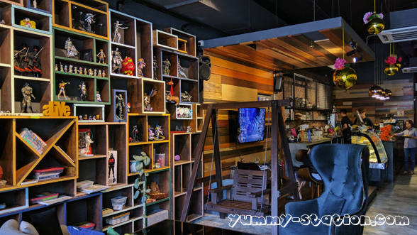
3 Leg Cat Cafe 三脚猫 has opened its business for quite some time at The Golden Triangle, Relau, Penang, and this is the first time I stepped inside the cafe. Actually, I went there last time with friends but at that time, it was almost the closing time, never make it in the end. 3 Leg Cat Cafe is easy to find, you will never miss it.

There are a lot of anime figurine displayed in the cafe. There is a swing too! Also, a place for you to play PlayStation games with its big TV screen!

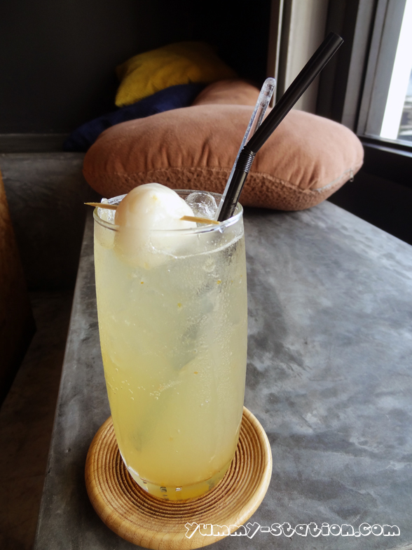
Drinks
Salted Caramel Latte (Hot) – RM10

Yuzu Lychee Soda – RM13
Butterscotch Espresso Blend – RM15

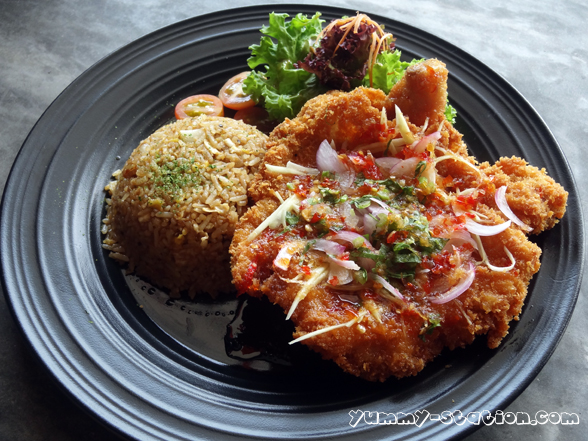
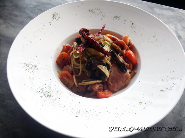
Food
Curry Nasi Lemak Kok Kok Rice – RM16

Sir Bacon & Egg Waffle – RM16

Spicy Thai Sauce Chicken with Garlic Rice – RM20
Smoked Duck & Bacon Spaghetti – RM20
Pork Burger – RM16
Add On
Egg +RM1
Bacon +RM2

Ms Strawberry Choco Waffle – RM14

Overall, all the food are quite good, a bit out of my expectation. I don’t expect cafe will serve a nice food but 3 Leg Cat Cafe is an exception. For the food, my first choice will be the Curry Nasi Lemak Kok Kok Rice. I like the sauce and the chicken is so tender. Follow by Spicy Thai Sauce Chicken with Garlic Rice. The Chicken comes in a big piece and it is fried until very crispy! Tender and juicy! For Pork Burger, both Egg and Bacon MUST be added!!!
3 Leg Cat Cafe is really a good place for friends gathering. You can chit chat while having a really good meal. At the same time, you can have fun playing the PlayStation game with your friends on the big screen TV!
However, parking is a problem at The Golden Triangle. All cars are parked by the roadside although it is double line! I have no idea why it is double line there actually. I think this is ridiculous as so many shops there and if it’s double line, where should the customers park?
Business Hour:
Monday – Closed
Tuesday to Friday – 11am to 11pm
Saturday and Sunday – 11am to 12am
Address: The Golden Triangle, 29-1-62, Jalan Paya Terubong, Relau, 11900 Bayan Lepas, Penang, Malaysia.
Contact: +6012-427 3021
As part of studying vendor collective usability and product presentation, I explored check oak meadow marketplace collective – The product photos are clean and clear, and the descriptions provide helpful details for each item.
During casual research into marketplace exhibition pages and online vendor systems for inspiration and usability evaluation across sample interfaces Dune Meadow vendor display page the layout remained clear and navigation felt effortless across sections – Smooth performance with organized content flow and fast loading behavior overall
As part of a casual review of online marketplace showcase ideas and digital vendor directories for design understanding Pearl Cove storefront gallery link I noticed the pages were arranged in a logical order that made exploration feel natural and uninterrupted. – The platform was responsive and content loaded efficiently while maintaining a clean layout
During a relaxed exploration of online vendor showcase systems and marketplace gallery designs for inspiration and structure analysis Pearl Cove shopping gallery portal I observed that the navigation remained stable and predictable throughout the browsing session. – The site felt smooth to use with fast loading pages and clear organization
While conducting interface inspections of solar themed marketplace systems, analysts observed strong visual cohesion and modern styling, but found gaps in content delivery around a href=”//sunharborvendorroom.shop/](https://sunharborvendorroom.shop/)” />sun harbor commerce vendor room node where Sun harbor design remains attractive yet the vendor room lacks descriptive elements, making the section feel incomplete despite its polished appearance
People who prefer efficient financial platforms often engage with sites like Harbor River Trade Flow Portal where market information is displayed in a minimal structured layout – The interface ensures navigation feels easy, logical, and focused on clarity for smooth trading decisions.
While scanning through different curated resources and online discovery threads, I found something that felt straightforward and easy to use, especially where this simple navigation page appeared – the structure feels reliable and clean, so I might revisit it soon for further exploration.
Many users exploring online catalogs highlight that clear presentation of items improves satisfaction, especially after accessing Floraridge Shop Directory – It is often described as a helpful layout that simplifies browsing and supports faster discovery of desired goods in an organized manner while reducing cognitive load during selection
After exploring several less structured websites, I found review this option and liked the experience because everything is organized here, making it straightforward to understand the information presented.
While searching for smooth and fast online platforms, I stumbled upon open fast loading portal – The website has a clean interface, with everything working smoothly and loading fast, making navigation simple and efficient.
Across ecommerce UI prototype reviews, testers noted a well executed sun inspired design system with clear brightness and hierarchy, but missing depth in sections such as a href=”//sunharborvendorroom.shop/](https://sunharborvendorroom.shop/)” />sun harbor vendor hub room panel where Sun harbor branding is visually consistent while the vendor room contains no descriptive or contextual information for user interpretation
People who prefer organized financial systems often engage with sites like Harbor River Trading Insights Portal where information is arranged clearly – The interface ensures users can follow market data in a structured and easy way.
Many online shoppers report that centralized vendor hubs make browsing more efficient, especially when they reach Vendor Room Central Hub – The platform is often praised for its logical structure and ease of navigation across listings which helps users stay oriented while browsing
As I continued browsing various niche listings and online recommendation pages, I came across something that seemed quite dependable and simple in structure, particularly references including this reliable browsing page – it feels easy to trust and navigate, so I’ll likely return later for a closer look.
While checking different online sources, I discovered see more here which stood out due to its clarity, and I found everything is organized here, helping users understand the content with ease.
As I browsed fast and minimal websites, I came across view quick performance page – The interface is clean and simple, with fast loading times and smooth operation that creates a very pleasant browsing experience.
While exploring various curated marketplace directories and online resource hubs, I came across something that felt well structured and easy to navigate, especially where Ivory Ridge market hub appears – Browsing here feels smooth overall, with nothing complicated or hard to understand, making it easy to move through content naturally.
While evaluating staged online shop templates and conceptual storefront systems, testers identified a central content link using willow drift market room inside layout structure – absence of willow imagery leaves the page feeling half finished with placeholder aesthetics dominating several key visual sections
While reviewing sandbox storefront interfaces and seasonal marketplace designs, testers observed a mid page module containing harbor apricot lounge vendor portal embedded into page structure, and despite the pleasant styling, apricot harbor returns again at the end making it the final listing of the day and it feels decent enough overall
When browsing various vendor platforms, usability and clarity often determine how effective the experience feels for users Canyon Harbor trade portal this platform ensures a well-organized layout that makes it easy to browse products and locate relevant items efficiently
During a casual browsing session through niche listing pages and discovery threads, I noticed something that stood out for its clarity and usability, particularly Ridge ivory trade portal – The browsing experience feels smooth, with nothing complicated or hard to understand, which makes everything feel simple and accessible.
Across sandbox ecommerce testing environments and vendor UI systems, testers encountered navigation elements containing apricot vendor harbor marketplace parlor within structured layout, and although the interface is smooth, apricot harbor shows up again as the final entry for today making it a decent enough ending but slightly repetitive in tone
While reviewing experimental storefront layouts and UI mockups, analysts found a content embedded module featuring willow market drift node integrated into page structure – the lack of willow tree imagery leaves the design feeling flat and incomplete with several sections appearing like placeholders
Digital shoppers often prefer platforms that offer well-structured navigation and efficient browsing tools for convenience Canyon Harbor shop directory this platform provides a seamless and organized experience that makes exploring product listings straightforward and enjoyable
During exploration of digital product showcase systems and marketplace directory concepts for design evaluation and inspiration across multiple examples Dune Meadow product showcase link navigation stayed fluid and content was easy to browse without confusion – Clean structure with fast page loads and stable interface performance overall
While going through online commerce lounge directories and vendor listings, I came across multiple amber-toned layouts, especially Amber ridge vendor lounge commerce page – The design feels modern and warm, but the text contrast makes it a bit visually tiring.
While reviewing vendor display platforms and experimental commerce gallery systems for structural analysis and UX comparison across various layouts Dune Meadow trade listing board pages responded quickly and browsing felt efficient and simple – Well structured design with responsive interface and minimal visual noise throughout experience
As I browsed through curated vendor lounge platforms and marketplace listings, I came across several amber-colored layouts, particularly Ridge amber vendor commerce lounge page – The design feels warm and inviting, but the text clarity is slightly compromised by color blending.
solarorchardartisanemporium.shop – Great for gift shopping, everything arrived in one piece.
While browsing through various online platforms for usability comparison, I came across something in the middle like visit this simple page which had a simple layout overall, making browsing feel really smooth and easy without any unnecessary distractions or confusing elements during navigation.
Users who enjoy cozy handcrafted ecommerce systems often engage with sites such as Flint Brook Artisan Home Craft Hub where products are arranged in a welcoming structured layout – The design ensures browsing feels smooth, warm, and easy to navigate throughout the store.
In the middle of exploring online platforms, I discovered browse this link which had a simple layout, making browsing feel really smooth and giving a clean, easy-to-navigate experience overall.
Users who prefer bright ecommerce stores often explore sites such as Cove Sun Goods District Central Hub where products are displayed in a well organized format – The browsing experience feels smooth and enjoyable, with clear structure that helps users find items easily without confusion.
solarorchardartisanemporium.shop – Great for gift shopping, everything arrived in one piece.
While reviewing sandbox ecommerce platforms with coastal inspired design systems, testers observed a strong teal aesthetic that enhances user comfort, but identified missing category hierarchy in modules like a href=”https://tealcovemarkethall.shop/
” />teal cove marketplace hall gateway access where the teal cove interface feels modern and polished, yet the market hall lacks sufficient product categorization which reduces browsing effectiveness during UX testing sessions
After exploring several online resources, I discovered look into this which provided a smooth experience overall, since pages loaded quickly and everything functioned properly without interruptions.
Users who enjoy cozy handcrafted ecommerce systems often engage with sites such as Flint Brook Artisan Home Craft Hub where products are arranged in a welcoming structured layout – The design ensures browsing feels smooth, warm, and easy to navigate throughout the store.
People who prefer simple and bright online shops often explore sites like Goods District Sun Cove Market where items are arranged in a structured and user friendly design – The browsing experience feels enjoyable and efficient, with clear categories that help users find what they need quickly.
Across UI prototype evaluations of modern digital marketplaces, analysts observed a smooth teal color palette that enhances brand identity and visual comfort, however product structuring remains incomplete in modules like a href=”https://tealcovemarkethall.shop/
” />teal cove market hall access gateway where the teal cove theme appears well executed visually, but the market hall lacks detailed category organization which affects usability during system testing and interface analysis procedures
calmcovevendorparlor.shop – Really nice platform, easy browsing and smooth user experience today
In the middle of checking different platforms, I discovered visit this platform and noticed how smooth everything felt, as pages loaded quickly without issues and navigation stayed responsive throughout the experience.
Many digital buyers note that well-designed vendor platforms improve browsing confidence and reduce time wasted on irrelevant pages, especially when they access Vendor Access Forest Cove which is often described as streamlined and user-friendly – reviewers highlight clearer organization and easier product selection.
Exploring digital vendor sites is more enjoyable when the layout is clean and navigation feels smooth and well organized like here Silk Meadow vendor center the browsing experience felt natural and everything was easy to locate throughout the site
While browsing Hawaiian retreat accommodations with boutique appeal and scenic settings, I encountered a polished listing page recently highlighted online < holualoa guesthouse listing – It feels well structured and inviting, giving a smooth overview that highlights comfort and relaxed atmosphere clearly overall feel
Across experimental retail UI tests, reviewers spotted an embedded navigation element dune market ridge hall access link sitting within content block but suffers from sandy tone blending reducing text visibility and readability – Dune inspired palette is cohesive yet users struggle to read important labels especially in dense layout sections
During a general browsing session across curated resource pages and online discovery threads, I found something that stood out with a strong first impression, particularly with this vendor hub access link included – the platform looks well organized and structured, so I’ll likely revisit it again soon.
calmcovevendorparlor.shop – Really nice platform, easy browsing and smooth user experience today
While scanning through niche listing pages and discovery platforms, I noticed something that stood out for its usability and clarity, especially when seeing Jewel brook access hub included – This seems useful overall, and I found the content quite straightforward today, making everything feel simple and efficient.
Exploring online vendor platforms often highlights which sites are optimized for usability and accessibility across different categories Canyon Harbor marketplace entry this platform delivers a smooth and well-structured browsing experience that feels easy to follow and efficient overall for regular usage
While testing demo marketplace interfaces designed around desert aesthetics, engineers observed that dune commerce hall gateway module embedded in content flow appears functional but suffers from poor contrast leading to user confusion during navigation – Dune inspired styling is visually appealing yet readability drops significantly in sunlit themed backgrounds causing strain