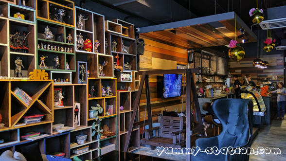
3 Leg Cat Cafe 三脚猫 has opened its business for quite some time at The Golden Triangle, Relau, Penang, and this is the first time I stepped inside the cafe. Actually, I went there last time with friends but at that time, it was almost the closing time, never make it in the end. 3 Leg Cat Cafe is easy to find, you will never miss it.

There are a lot of anime figurine displayed in the cafe. There is a swing too! Also, a place for you to play PlayStation games with its big TV screen!

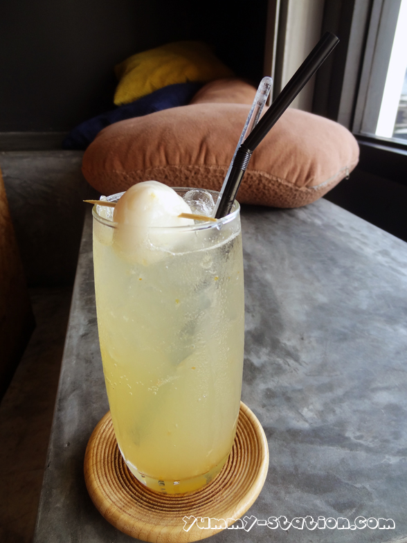
Drinks
Salted Caramel Latte (Hot) – RM10

Yuzu Lychee Soda – RM13
Butterscotch Espresso Blend – RM15

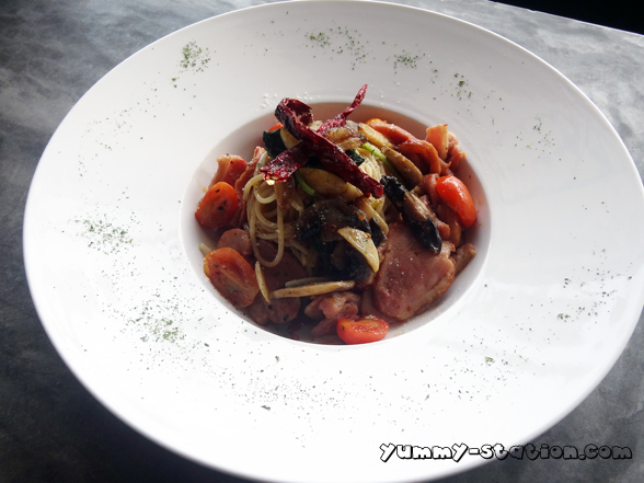
Food
Curry Nasi Lemak Kok Kok Rice – RM16

Sir Bacon & Egg Waffle – RM16

Spicy Thai Sauce Chicken with Garlic Rice – RM20

Smoked Duck & Bacon Spaghetti – RM20
Pork Burger – RM16
Add On
Egg +RM1
Bacon +RM2

Ms Strawberry Choco Waffle – RM14

Overall, all the food are quite good, a bit out of my expectation. I don’t expect cafe will serve a nice food but 3 Leg Cat Cafe is an exception. For the food, my first choice will be the Curry Nasi Lemak Kok Kok Rice. I like the sauce and the chicken is so tender. Follow by Spicy Thai Sauce Chicken with Garlic Rice. The Chicken comes in a big piece and it is fried until very crispy! Tender and juicy! For Pork Burger, both Egg and Bacon MUST be added!!!
3 Leg Cat Cafe is really a good place for friends gathering. You can chit chat while having a really good meal. At the same time, you can have fun playing the PlayStation game with your friends on the big screen TV!
However, parking is a problem at The Golden Triangle. All cars are parked by the roadside although it is double line! I have no idea why it is double line there actually. I think this is ridiculous as so many shops there and if it’s double line, where should the customers park?
Business Hour:
Monday – Closed
Tuesday to Friday – 11am to 11pm
Saturday and Sunday – 11am to 12am
Address: The Golden Triangle, 29-1-62, Jalan Paya Terubong, Relau, 11900 Bayan Lepas, Penang, Malaysia.
Contact: +6012-427 3021
Some websites feel complicated, but this one keeps everything smooth and easy to navigate throughout the experience Silk Meadow quick browse page I appreciated how well arranged everything was during my visit
While reviewing Hawaiian boutique stays with emphasis on comfort and scenery, I found a well structured property showcase online today < quiet retreat property card – It feels peaceful and organized, offering a clear understanding of the property while maintaining a relaxing tone throughout presented
During a casual browsing session across niche listing pages and resource hubs, I found something that seemed well designed and accessible, particularly references like Brook jewel vendor hub – The platform seems useful, and I found the content quite straightforward today, which made the experience smooth and clear.
As I continued browsing through curated resource collections and discovery lists, I found something that seemed well structured and appealing initially, particularly with this vendor access link included – the platform feels thoughtfully built, so I’ll likely check it again soon for further review.
When evaluating vendor platforms, smooth navigation and logical layouts are essential for user satisfaction Canyon Harbor trade access link this one delivers a consistent and organized browsing process that enhances usability and overall experience
While exploring various experimental marketplace layouts and digital vendor systems for usability research and UI comparison across multiple platforms, I came across Plum Cove goodsroom overview portal embedded in structured content – Simple interface, content is clear and very easy to read, making it straightforward to browse different sections without confusion or unnecessary visual clutter throughout the session.
As I browsed through different commerce platforms and vendor hubs, I came across a very new-looking site that seems lightly populated, particularly Cove goods Aurora room hub – The structure is clean, but only having three items per category feels somewhat unusual and incomplete.
During exploration of online marketplace frameworks and digital vendor directories for UX analysis and design inspiration across different references, I came across Plum Cove commerce goodsroom page within structured content – The interface is easy to read and well organized, allowing smooth navigation through sections without confusion or visual overload at any point.
As I browsed through different commerce vendor sites and marketplace hubs, I noticed a freshly launched platform that appears sparsely filled, particularly Cove Aurora goods commerce room hub – The design is clean, but the limited category listings feel slightly unusual.
Users who prefer handcrafted ecommerce environments often explore sites such as Teal Vendor Cove Creative Atelier Hub where products are presented in a stylish and artistic layout – The interface creates a visually engaging browsing experience that feels structured, modern, and thoughtfully curated for easy exploration.
Users who prefer structured ecommerce emporiums often engage with sites such as Timber Grove Market Emporium Hub where products are displayed in a rich organized format – The design makes browsing feel intuitive, easy, and efficient throughout the platform.
During my review of marketplace websites, this one stood out as a really nice platform with easy browsing and a smooth user experience today Calm Cove browsing portal I found it simple to move through sections without confusion
After browsing through several platforms, I encountered <a href="//woodharborvendorroom.shop/](https://woodharborvendorroom.shop/)” / see more here which appeared to be a helpful platform overall, and I might visit again sometime soon for additional information or use.
sageharborgoodsgallery.shop – Looks clean and minimal, easy to find information without confusion.
While reviewing UI sandbox ecommerce systems with consistent teal coastal styling, testers observed a well structured harbor themed interface, but the vendor hall lacks meaningful data when inspecting a href=”https://tealharborvendorhall.shop/
” />teal harbor vendor hub showcase node where the design appears clean and cohesive, yet the vendor hall continues to display Lorem ipsum placeholder text which limits usability during evaluation and interaction testing processes
Users who enjoy creative storefront experiences often engage with sites such as Teal Vendor Artisan Cove Atelier Hub where products are displayed in an artistic and clean format – The layout creates a structured browsing experience that feels engaging, balanced, and visually appealing.
People who prefer organized online emporiums often engage with sites like Grove Timber Supply Emporium where items are displayed in a structured layout – The interface ensures navigation feels smooth, simple, and easy to manage across categories.
Digital marketplaces benefit from a really nice platform that supports easy browsing and smooth user experience today Calm Cove item portal I enjoyed how clean and organized everything felt
During my search for useful online resources, I stumbled upon <a href="//woodharborvendorroom.shop/](https://woodharborvendorroom.shop/)” / click here to view which seemed like a helpful platform, and I might visit again sometime soon since it was easy to browse and understand.
During UX analysis of prototype ecommerce environments, analysts observed a clean teal harbor interface that supports consistent branding, but functional content is missing in vendor sections such as a href=”https://tealharborvendorhall.shop/
” />teal harbor marketplace vendor node where the UI appears structured and visually coherent, yet the vendor hall still uses Lorem ipsum placeholder text which reduces usability clarity during testing and evaluation phases
Алкогольная зависимость часто держится не на «желании выпить», а на страхе отмены. Человек пьёт, чтобы не столкнуться с тремором, потливостью, тошнотой, скачками давления, паникой и бессонницей. Поэтому помощь начинается с медицинской оценки: насколько состояние безопасно для прекращения, какие есть сопутствующие болезни, что усиливает риски и какой формат лечения нужен именно сейчас.
Подробнее тут – https://narkologicheskaya-klinika-orekhovo-zuevo2-12.ru/horoshaya-narkologicheskaya-klinika-v-orekhovo-zuevo/
During usability analysis of ecommerce demo systems and environmental themed UI kits, testers found a navigation module featuring elm harbor marketplace goods node embedded mid layout, but despite the cohesive natural branding, image links break frequently leaving blank placeholders instead of product visuals – Elm trees are strong, but the goods room has broken image links disrupting visual clarity
In the course of reviewing web consistency, I came across go to this page – the site appears extremely similar to another one, making it hard to ignore the repeated design choices.
When evaluating marketplace platforms, visual clarity and structured layouts are key factors in user satisfaction Forest Meadow vendor center this one provides a seamless browsing experience where users can locate relevant information without unnecessary searching
sageharborgoodsgallery.shop – Looks clean and minimal, easy to find information without confusion.
During a general exploration of marketplace listings and discovery pages, I noticed something that stood out for its usability and clarity, particularly references including Harbor moss vendor access page – It seems like a decent site, and I’ll probably check it again soon since the browsing experience is easy and comfortable.
zencovegoodsgallery.shop – Simple interface clear structure makes finding information very quick indeed
Домашние попытки обычно идут по двум сценариям. Первый — «пить понемногу, чтобы не трясло», что продлевает запой и усиливает истощение. Второй — резко прекратить и «терпеть», после чего симптомы отмены усиливаются волной, особенно ночью, и человек снова пьёт из страха. Врач помогает избежать этих крайностей: стабилизировать состояние и дать план, который делает первые сутки предсказуемыми и безопасными.
Подробнее тут – http://narkologicheskaya-klinika-klin12.ru
During a comparison of multiple marketplace websites, some stand out due to their visual clarity and well-organized layouts Forest Meadow gallery access point this one allows users to find useful information easily while maintaining a smooth and visually appealing browsing flow throughout sessions
During exploration of vendor gallery systems and online marketplace structures for usability research and design inspiration across multiple examples, I found Plum Cove goodsroom catalog entry embedded in structured content – The layout feels very readable and straightforward, allowing smooth browsing through sections while keeping everything clear and easy to follow from start to finish.
sageharborgoodsgallery.shop – Looks clean and minimal, easy to find information without confusion.
zencovegoodsgallery.shop – Simple interface clear structure makes finding information very quick indeed
As I explored different online directories and marketplace hubs, I noticed something that stood out for its simplicity and usability, particularly with Harbor moss browsing portal – The site seems decent, and I’ll probably check it again soon since everything is clearly arranged and easy to follow.
During exploration of curated e-commerce platforms and digital vendor directories for structural evaluation and UX insight across various examples, I came across Plum Cove commerce goodsroom interface placed within structured content – The layout is simple and readable, making it easy to browse sections while maintaining clarity and smooth navigation throughout the entire experience.
coralharbortradegallery.shop – Great browsing experience overall everything feels organized and easy today
While reviewing curated personal brand websites online, I found a clean portfolio style page that emphasizes structure and readability jackonson creative profile site – The layout is professional, with smooth navigation and information that is organized clearly for easy understanding overall
People who appreciate handmade creative platforms often browse sites like Cove Wind Artisan Collective Market Hub where items are displayed in a clean and balanced format – The interface ensures browsing feels smooth, organized, and visually appealing for all artisan goods.
Exploring digital vendor sites becomes more enjoyable when a clean layout makes exploring products easy and visually pleasant overall Autumn Cove vendor center everything felt smooth and easy to browse
Users who prefer creative ecommerce environments often explore sites such as Wind Artisan Cove Handmade Market Hub where products are arranged in a neat and balanced structure – The interface ensures browsing feels smooth, visually appealing, and well organized across all sections of the artisan store.
While browsing through online marketplace listings and trade platforms, I noticed a berry-inspired site with Berry house market cove entry – The design is nice and fresh, but it’s surprising that no contact page is present anywhere.
coralharbortradegallery.shop – Great browsing experience overall everything feels organized and easy today
While browsing curated personal profile websites, I encountered a polished portfolio page that emphasizes clarity and professional presentation online career portfolio hub – The navigation feels seamless, and the information is clearly structured for easy understanding and quick access throughout
While exploring different online platforms to compare usability and design quality, I came across something in the middle like visit this resource which appears very structured properly, making it easier for users to find things much faster without unnecessary confusion or wasted time.
People who appreciate practical digital marketplaces often browse platforms like Meadow Goods Juniper Store Hub where items are presented in a structured format – The design ensures browsing feels organized, efficient, and easy to understand throughout the store.
During exploration of commerce hubs and vendor directories, I came across a berry-themed marketplace page featuring Market house cove berry link – It looks visually fresh, yet the absence of a contact page raises some questions.
After going through several less organized platforms, I came across browse this resource and appreciated how structured everything was, allowing users to locate information quickly without confusion or delays.
During my review of marketplace websites, this platform stood out because its clean layout makes exploring products easy and visually pleasant overall Autumn Cove browsing portal I found everything clear and comfortable to use
People who appreciate structured online goods platforms often browse sites like Meadow Juniper Goods Network Hub where items are presented in a clean layout – The design ensures browsing feels accessible, organized, and easy to navigate across all sections.
Some websites feel chaotic, but this one keeps everything structured nicely so browsing feels smooth and comfortable overall Sky Harbor quick browse page I appreciated the clarity and ease of navigation throughout the site
While reviewing the design flow, I spotted visit vendor section – the “upland” concept suggests something premium or elevated, yet the lounge area itself lacks any substance and remains completely empty.